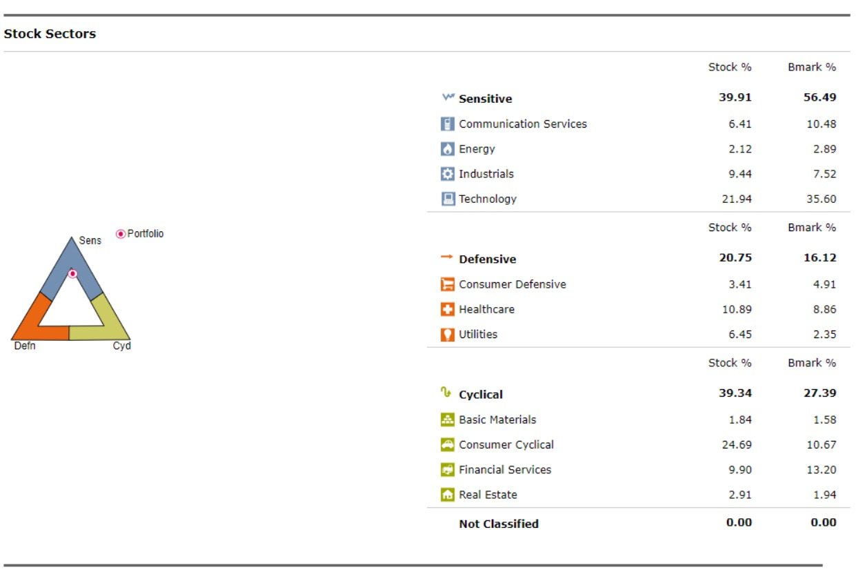
I am using Quicken Classic and since a few updates, the Stock Sectors graphic is incorrect. The triangle graphic on the left puts the dot in one of the extreme corners and not where it should be based on the data. How do I correct this?
Hello @Bitsmasher,
Thank you for posing this question and providing a screenshot to show what you are seeing; that is always helpful.
This is currently a known issue and is being worked on. We do not currently have an ETA as to when it will be resolved, and we apologize for any inconvenience in the meantime.
Thank you!
(CTP-14535)