Reports Customization-increase selection window size

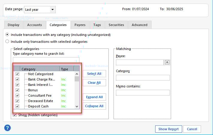
The Accounts; Categories; Payees; Tags; Securities windows sizes are far too small in width and height. The listed names are all truncated (can only see their full content by hovering) and only eight names are visible in the window. Such formatting was common in the DOS days it should be much more user friendly in 2026
Comments
-
I just found this on another similar post
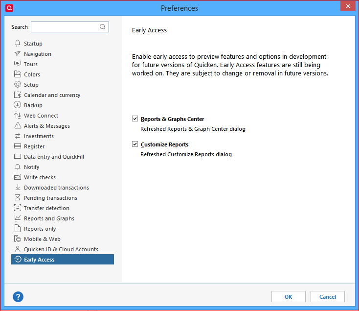
Edit > Preferences > Early Access
0 -
Agreed - much of the look and feel of Quicken seems to come from the old DOS days and many features haven't been updated to create a modern user experience.
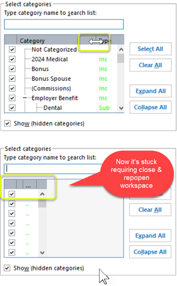
BTW - you can adjust the width of that Category column by stretching the header. Note that if you go too far, it will hide the scroll bar. You can also shrink the Type column, but it won't restore properly. This tool is quite buggy if you ask me.
 0
0 -
As @Stephen mentioned in his earlier post, you should try enabling the new interface in Edit / Preferences / Early Access. The Categories selection window now is a little wider …
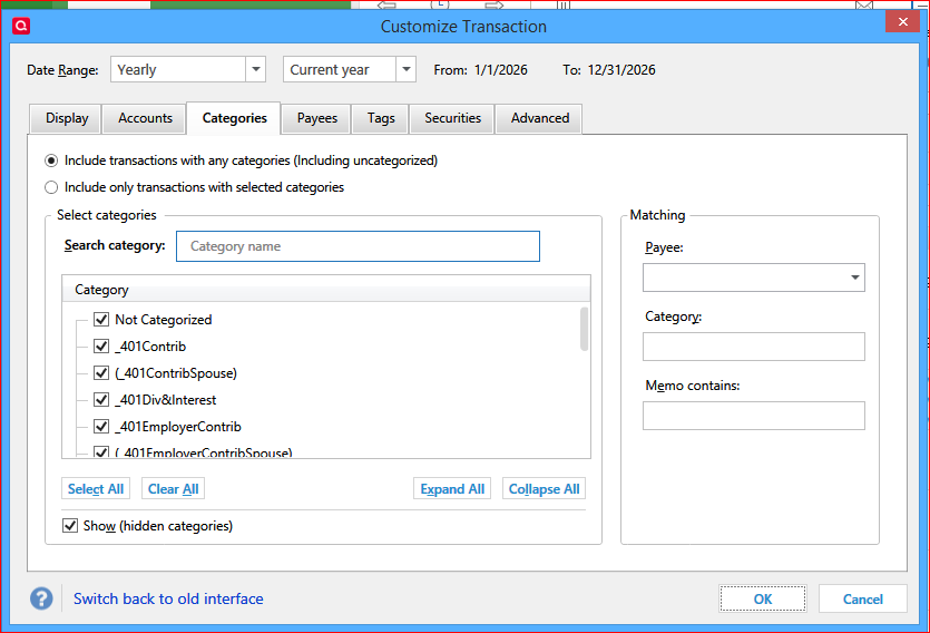
If you don't like it or if it doesn't work for you, you can easily switch back to the old (smaller) interface.
0