Why are there no pie charts for spending by category on MacOS but in the Quicken Classic iOS App?
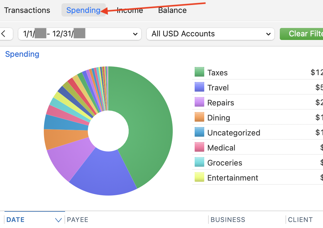
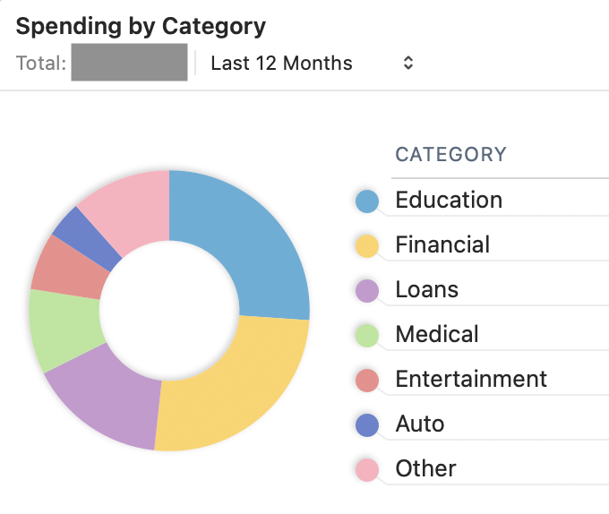
Reviewing spending by categories by drilling into pie charts, is a very useful feature when working with a spouse or significant other when discussing "where did the money go?"
These discussions usually result in discovering a transaction that was mis-categorized - a/k/a - "mine vs yours", and the ability to correct a transaction's categorization, and redisplay the pie chart - was indispensable in the past (on Windows).
This works-ish on an iPad using the latest Quicken Classic app (clearly someone at Quicken sees the value or this wouldn't be a feature), but there is absolutely no support with MacOS.
If there is no plan for actually developing this functionality, can the export of this report include an option to "export for graphing" which deletes the extraneous header rows and other "filler" rows in the CSV to make this possible without wasting time in either Excel or Numbers?
I can't even tag this thread with anything related to Charts.
Comments
-
@BobSc You'll be happy to know that there are actually two places with Spending pie charts which already exist in Quicken Mac. I think you've just missed them. 😉
(1) In the left sidebar, click on one account, or an account group like Credit Card or Banking, or All Transactions. This opens the normal register. But above the registers, there are tabs for Register, Spending, Income and Balances. Click Spending, and the top of the resulting screen will be a pie chart showing spending by category:
Hovering your cursor over any pie wedge will show the dollar amount for that category, the percentage of all spending, and the number of transactions. You can click on any pie wedge to drill down to see subcategory breakdown if any, and the register below will show the specific transactions for the category or subcategory.
(2) You can also open Home > Dashboard and use the spending by Category card to view your spending for the time period you select:
By clicking on the ••• icon in the upper right of the card, you can customize the card to only include certain accounts and/or certain categories. For instance, for many of us, taxes might be one of, if not the single, largest expense categories, and you might want to see your spending without taxes; you can edit the categories included in the charge to exclude taxes and get a more useful pie chart. Note also that you can duplicate any Dashboard card, so you could have multiple Spending By Category cards you customize individually, such as "My Spending" and "Your Spending" (if you use different categories or accounts) or whatever you want.
Quicken Mac Subscription • Quicken user since 19930
Categories
- All Categories
- 20 Product Ideas
- 34 Announcements
- 247 Alerts, Online Banking & Known Product Issues
- 19 Product Alerts
- 518 Welcome to the Community!
- 682 Before you Buy
- 1.5K Product Ideas
- 55.7K Quicken Classic for Windows
- 16.8K Quicken Classic for Mac
- 1K Quicken Mobile
- 834 Quicken on the Web
- 128 Quicken LifeHub


