New Portfolio display

I am having trouble understanding the new portfolio display with Shares and other info in italics and greyed out and a timer next to things. Other than the update release notes I can't find any real info about why this was changed and how it is a benefit. The old display was very clean and simple. Any help would be appreciated.
Answers
-
Those aren't timers, they're pie charts. You'll see that when you have your Portfolio screen set up to sort by asset class and you have a mutual fund investment that's split across different investment classes. If you click on the pie chart symbol it will pop up an abbreviated explanation of what it means.
Here's an example:
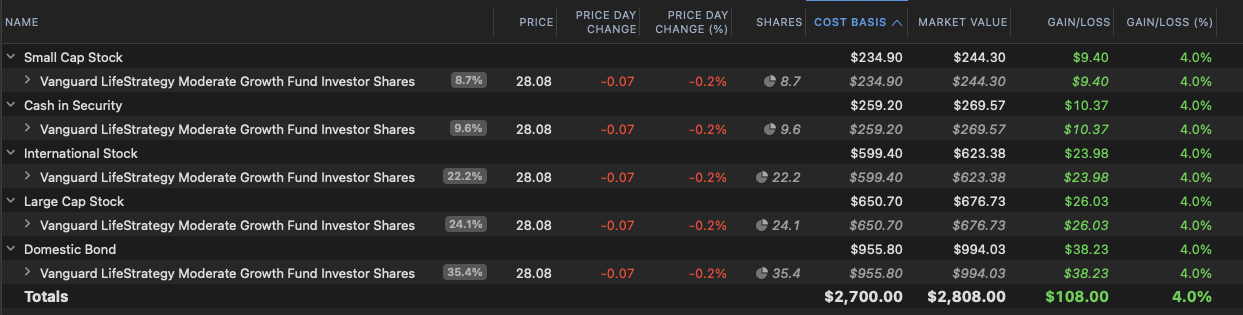
Here I have an account with 100 shares of VSMGX, a Vanguard mutual fund that invests in a mix of stocks & bonds. I have my portfolio view set to sort by Asset Class, so it's showing me how much of the fund is invested in each asset class. The pie chart symbol & italics are saying "this isn't all of VSMGX, it's just a percentage of it".
If you look at the Shares column, those numbers aren't real shares. For example, I don't have 8.7 shares of a Small Cap stock fund, but 8.7% of VSMGX is invested in small cap stocks so it's showing me how much of my 100 shares of VSMGX are in small cap stocks. If you add up all the share values in italics it adds up to 100 shares.
Same thing with the Cost Basis, Market Value, and Gain/Loss dollar amounts. It's taking the value of VSMGX and splitting it up across the different asset classes; the italics are letting you know those are fractional values and not the entire cost basis, market value, or gain/loss of that investment.
Compare that to what you get if you just buy a stock instead, let's say Apple:

Here, there's no pie chart symbol and no italics because my Apple investment is 100% large cap stock. Quicken doesn't need to split it across multiple asset classes, so the number of shares is the actual number of shares and the market value is the entire market value of the investment.
1 -
Wow, thanks so much foir the explanation. I wish the release notes held this kind of detail. Do you know if there is away to get a simpler display if I don't want to deep dive like this?
0 -
The Asset Class view is always going to look like that, but you don't have to sort by Asset Class. You can select the "By Asset Class" button above the graph and change it to something like "By Security" and get a simpler listing of each investment not broken up.
0 -
Thanks again Jon.
0