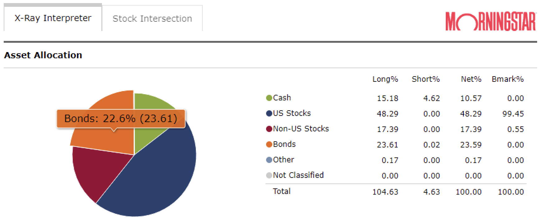
X-Ray Allocation Pie Percentages

Why are there (2) percentages shown on the X-Ray pie for each category?
One matches the table (in parentheses), the other does not.
Answers
-
Those are supposed to represent your Net% and Long%. However Net% is rounded to 1 decimal for some reason. Not sure why your Net% is off in the graph. Mine all match. The only difference is I don't have any short% so maybe the graph is doing something strange with that. Looks like a bug. You should report it (Help > Report a problem)
Quicken Windows user since 1993.
1 -
You nailed it - thanks! It has to do with shorts. Nothing is broken.
In my case that's some hedging going on in my foreign bond and equity holdings (BNDX and VEU).
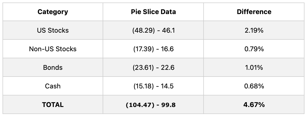
I subtracted the smaller net percentages from the larger long percentages (in parentheses) in each of the four allocation pie slices, and the combined difference was very close to the total short 4.63% shown in the table. The table asset categories don't agree with the pie slice data, but the overall closely agrees.
They both may be correct - the pie shows shorts per category and table shows that it's primarily executed in their respective cash positions.
 God bless you and your precious families - Langston0
