Just some feedback on INCOME AND EXPENSE REPORT window.
Let Quicken know if you are finding similar issues.
R38.25 New Report Windows in Modern Dashboard - FEEDBACK
Scooterlam
Quicken Windows Subscription SuperUser ✭✭✭✭
[Moderator Note: Do not close thread]
R38.25 update introduces 3 new report windows/portlets/panes.
In the modern dashboard, Income and Expense window, when clicking on either expense or income bar, Quicken opens a standard report to show a standard category detail report, followed by the ability to further drill into the transaction level report. Excellent!
1. When drilling down into the Income and Expense standard report, IMO, it must be internally consistent with the modern dashboard window. Image 1. In my case, the standard report includes business accounts whereas the modern dashboard does not. I get that most users may not have business accounts and yes I understand that my business flows to personal. Removing the business categories in the standard report makes this view consistent. Image 2.
However, IMO, drill-down figures/summaries between the modern dashboard view and lower level detail reports should be consistent. They are both "standard" reports and I would expect consistency.
Quicken has many of these inconsistencies that serve to confuse/frustrate users. Please don't create new functionality that continues this behavior.


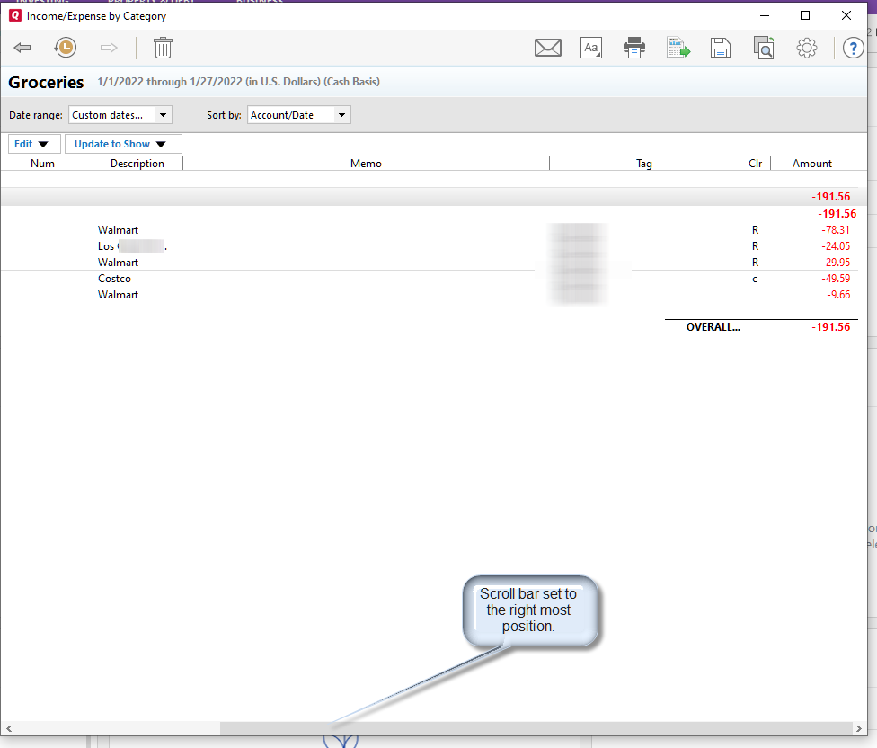
2. When drilling further down from the standard category report to the transaction level standard report, I get an oddly formatted report. Image 3. The horizonal scroll bar positions itself to the right of the report. Not all transaction level reports behave this way, although most all do. Why not show the entire transaction report? That is, also include category and payees?

3. Bar colors inconsistent between modern report window and standard category report. Image 3.

4. Appears that the "update now" date and time stamp is not working. Image 4. I did an OSU earlier and then directly updated by clicking on "update now". I found no change in date and time stamp.

R38.25 update introduces 3 new report windows/portlets/panes.
In the modern dashboard, Income and Expense window, when clicking on either expense or income bar, Quicken opens a standard report to show a standard category detail report, followed by the ability to further drill into the transaction level report. Excellent!
1. When drilling down into the Income and Expense standard report, IMO, it must be internally consistent with the modern dashboard window. Image 1. In my case, the standard report includes business accounts whereas the modern dashboard does not. I get that most users may not have business accounts and yes I understand that my business flows to personal. Removing the business categories in the standard report makes this view consistent. Image 2.
However, IMO, drill-down figures/summaries between the modern dashboard view and lower level detail reports should be consistent. They are both "standard" reports and I would expect consistency.
Quicken has many of these inconsistencies that serve to confuse/frustrate users. Please don't create new functionality that continues this behavior.
Image 1

Image 2

2. When drilling further down from the standard category report to the transaction level standard report, I get an oddly formatted report. Image 3. The horizonal scroll bar positions itself to the right of the report. Not all transaction level reports behave this way, although most all do. Why not show the entire transaction report? That is, also include category and payees?
Image 3

3. Bar colors inconsistent between modern report window and standard category report. Image 3.
The modern report window expense bar shares the same or very similar color as the income bar in the drill down, category report! I would expect consistency here and certainly would not expect income and expenses to share the same color.

4. Appears that the "update now" date and time stamp is not working. Image 4. I did an OSU earlier and then directly updated by clicking on "update now". I found no change in date and time stamp.
Image 4

1
Comments
-
More . . . R38.25 update introduces 3 new report windows/portlets/panes.Just some feedback on the NET WORTH REPORT window.
Let Quicken know if you are finding similar issues.
Noted a few things...
1. Other than the last bar of the net worth report window, it appears that assets and liabilities are not internally consistent with Quicken's Net Worth standard report - what I am seeing anyway... Image 1. I have not deep-dived further into where the discrepancies lie. Compare standard Net Worth report with same month ending date in the bar chart and you may see a difference. I would have expected them to be the same - given they are both "standard" net worth reports and the term "net worth" should be defined the same, at least within the app.... Perhaps the new report window corrects past deficiencies in the standard report? Account type / count differences in the queries? I know there have been reported issues with NW reporting and perhaps too this factors in. Or not...
Image 1
2. The drill down from a net worth bar to open a new Asset and Liability window is missing the Liability Chart. Perhaps that the liability amount is too small and percent of total is 0? But there still is liability...
Image 2
3. Strange selection of x-axis dates on the bar chart vs. date in the Assets v. Liability popup window associated with that bar. Image 3. Would expect dates to be consistent.
Also related....The mouseover and window dates are inconsistent with the standard network report (ex. "last year") and the Asset vs. Liability popup. Image 3/4.Image 3
Image 4
Not a confidence builder in the new modern dashboard.1 -
Excellent review.
1 -
The time periods offered in the Dashboard card pull-downs should be the same as those offered in standard windows. For example, I frequently use the "Last 12 Months" time period, but it is not available in the Dashboard cards.
A work in progress.1 -
It is worrisome that they have proceeded in adding new "Cards" but haven't fixed the bugs first.
For instance, they aren't saving all the settings correctly. If you change some settings, and restart Quicken you will see this. Interestingly they seem to save the date range in actual graphs, but the pulldown menus go back to the default settings.
1 -
@Quicken Paloma
Now that you know....can you take these (and prior unresolved) modern dashboard issues away and drive them into product mgt. for resolution?0

