Make the whole UI conform to Windows control standards

Back in the Windows 3.1 days and maybe even a little later, folks writing code for Windows apps didn't know how to use the various controls available. So menu bars would open dialogs, buttons would pop out menus, etc. Fast forward decades and Quicken is still saddled with TONS of this.
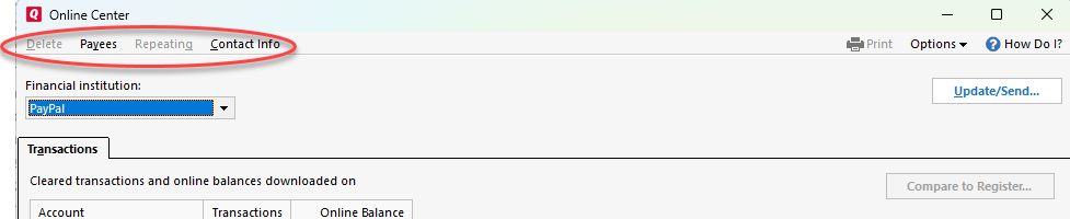
A perfect example is:
says: "Menus and context menus are similar in how they look and what they can contain. They both display an organized list of commands or options and save space by hiding until the user needs them.", which is what I expect them to do.
The above looks like a menu bar, so as above, one expects a menu to drop down when each item circled in red is clicked. But no.
The appropriate control to delete a transaction, open the payees dialog, open the repeating or cantact info dialogs is a BUTTON as described in the below linked materials:
"A button gives the user a way to trigger an immediate action."
And if the Quicken developers would argue that their standard is to make menu bar items trigger direct actions such as the ones above, then why is "Update/Send" a button?
You see what I mean. This misuse of controls must be fixed throughout the application. The above is just one of many examples.
The quicken developers can reference this or similar to get it all fixed:
Comments
-
This would require a complete re-write of Q's UI … so ain't gonna happen anytime soon.
Q user since February, 1990. DOS Version 4
Now running Quicken Windows Subscription, Business & Personal
Retired "Certified Information Systems Auditor" & Bank Audit VP0
