First ever post. Please be kind…….
Lots of previous discussions about asking for Sankey charts to be implemented in Quicken. Rather than wait, I have been working on creating this ability outside of Quicken, using the XLSX export feature of Quicken's built-in Transaction report. Because it is not integrated, it is a bit clunky (Run report in Quicken → Export report as Excel (XLSX) → Remove extraneous rows from the Excel/XLSX file → Run the Sankey software). Once you have the rhythm, it goes pretty quickly.
I haven't built it for mass consumption. I just built it to meet my needs. For example, I explicitly only look at Expenses because this is my core use case. I ignore all Income and Investments. But I've been using the tool for a few weeks and it's been really delightful to have this interactive visualization of my transactions.
The software is free and is available on my GitHub site:
https://github.com/mgkahn/Quicken_Sankey
Read the README to understand the sequence and how to launch a local web server (needed for the interactive parts). I am open to suggestions, but as I mention in the Acknowledgments, HTML/CS/JS is NOT a set of technologies that I understand.
WARNING: This is new software and I am absolutely certain there are bugs. Use GitHub's Issues tab to let me know what you find. No promises what ChatGPT can fix for me.
I know the software works on MacOS using the XLSX file generated by QWIN. But since I do not have/use Quicken for Mac, I do not have the ability to test the Quicken Transaction XLSX export features on QMAC. If somebody on that platform can give this a go, I would appreciate hearing from you in GitHub.
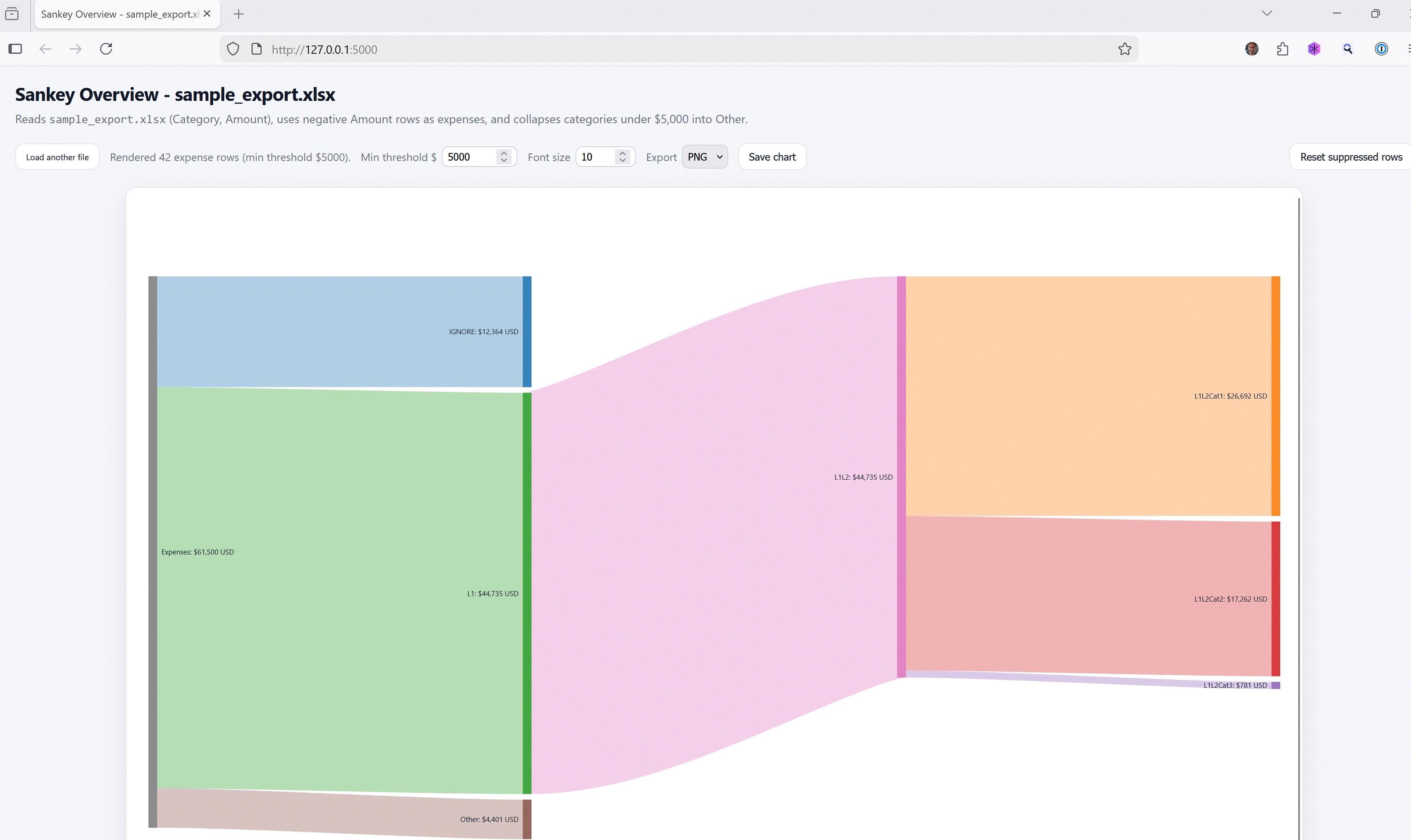
Looks more impressive with real Quicken data rather than the goofy fake data I created for the sample illustration. If somebody has a more realistic Excel or CSV file of fake transaction data that includes the categories in Quicken's colon-separated format, please send my way via GitHub.