Consistent Ordering in the Asset Allocation Chart

RogiQ
RogiQ Quicken Windows Subscription Member
edited February 1 in Display/UI

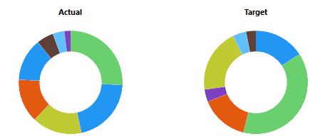
It would be helpful if the asset order was consistent between the "Actual" and "Target" pie charts in Investing > Allocations > Asset Allocation.

Right now, you have to do a some mental acrobatics to reorder the assets when comparing the charts.

image.png

The "Actual" chart doesn’t appear to follow the order shown in the allocation table:

image.png
9
9 votes

Reviewed · Last Updated

Comments

  • NotACPA
    NotACPA Quicken Windows Subscription SuperUser ✭✭✭✭✭
    edited December 2025

    re: Target circular graph vs. allocation table. If you start at 12 o'clock and work clockwise, the 2 seem to match exactly, other than the "Other Asset class" probably being too small to be seen, if present at all.

    And the Actual circular graph seems to be organized by the quantity that you hold, again starting at 12 o'clock and working clockwise.

    Q user since February, 1990. DOS Version 4
    Now running Quicken Windows Subscription, Business & Personal
    Retired "Certified Information Systems Auditor" & Bank Audit VP

  • Jim_Harman
    Jim_Harman Quicken Windows Subscription SuperUser ✭✭✭✭✭
    edited December 2025

    I agree that this is an annoying problem.

    This has been an issue since at least 2018. For the Target allocation, the doughnut slices are in the same order as the allocation chart, going clockwise from 12:00. The slices in the Actual chart are also clockwise starting from 12:00, but they are in largest to smallest order.

    QWin Premier subscription
  • tgrantdavis
    tgrantdavis Quicken Windows Subscription Windows Beta Beta
    edited April 9

    This is annoying, and it should be fixed. It is still wrong in the current R66.28.

    image.png


    The real goal here is for Quicken to help us to understand and act on asset allocation. What we really need is a better way to see allocations against targets, and to know what actions to take to rebalance. Two pie or donut charts do not do that very well. It is an awkward operation to visually subtract the slice on the right from the corresponding one on the left, even when they are in consistent color and order. The table shows percentages, but then I have to get out my calculator to decide how much to sell and buy. Adding dollar values to the table would help that. But you can't really see very well the differences from targets in the donut graphs. Pie charts are an industry standard format, but they are not very good.

    I like a totally different format for the graph that leads me much better toward the actions. I have to hand export my data into a spreadsheet to do it. The graph is a rectangular X-Y graph. The x-axis is the target allocation from 0-100%. The y-axis is the ratio of actual to target from 0 to beyond 100%. Adjacent boxes are drawn for each category. The total area of the boxes is 100%x100%. The boxes taller than 100% suggest selling to rebalance into the ones below 100%. The magnitudes can be seen in the areas above/below the y=100 line. It still requires a table to know how much to buy/sell. The table sits below the graph, in the category order of the graph, showing total dollars, and delta dollars. Thus, I first look at the graph to clearly see what to do, if anything. Then I look down from the box to the table to see how much. Then, I have to look into the holdings to figure out exactly what actions to take.

    image.png