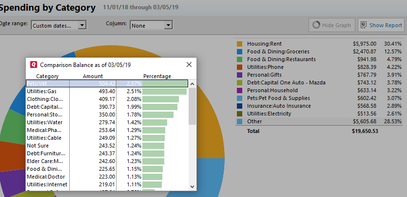
When I create a spending report by category, a large group of items fall under "other" why?
rrbutler
Quicken Windows Other Member
Here is a screen shot of my issue. Notice that all of the items that show up in the category "Other" actually have a category/subcategory assigned. The small chart is what I get when I click on the "Other" category on either the pie chart or the list next to it.

It is messing up the data when it does this.
Thanks in advance for your help.

It is messing up the data when it does this.
Thanks in advance for your help.
0
Best Answers
-
All the items grouped under Other are not all subcategories (for example, Not Sure is not a subcategory).
What do you mean by "It is messing up the data when it does this"? From the information you've provided, everything presented appears to be appropriate.6 -
What's happening here is that to avoid having a lot of tiny slivers in the pie chart, Quicken limits the chart to 10 slices for your largest categories or subcategories plus the "Other" slice, which lumps together all the smaller items. I think you will find that if you add up all the percentages in the list at the left, they will add up to the "Other" total.
If you want a list of spending by top-level Category with percentages and all the Categories shown, try the Spending tab. Alternatively, you can export this report to Excel and analyze the data there.QWin Premier subscription7 -
Your "Other" slice is somewhat lopsided as a result of your spending habit for the duration you selected. If Quicken displayed every category for 11/01/18 - 3/05/19 as you specified the doughnut graph would be unreadable.You can drill-down to any category by clicking on the slice.6
Answers
-
All the items grouped under Other are not all subcategories (for example, Not Sure is not a subcategory).
What do you mean by "It is messing up the data when it does this"? From the information you've provided, everything presented appears to be appropriate.6 -
What's happening here is that to avoid having a lot of tiny slivers in the pie chart, Quicken limits the chart to 10 slices for your largest categories or subcategories plus the "Other" slice, which lumps together all the smaller items. I think you will find that if you add up all the percentages in the list at the left, they will add up to the "Other" total.
If you want a list of spending by top-level Category with percentages and all the Categories shown, try the Spending tab. Alternatively, you can export this report to Excel and analyze the data there.QWin Premier subscription7 -
Your "Other" slice is somewhat lopsided as a result of your spending habit for the duration you selected. If Quicken displayed every category for 11/01/18 - 3/05/19 as you specified the doughnut graph would be unreadable.You can drill-down to any category by clicking on the slice.6
-
Thanks all that answered my question. I understand better what's going on with it. I appreciate the help.0
This discussion has been closed.


