1-Month & 12-Month View - Expand Category Column (Q Mac)

mybank2002
Quicken Mac Subscription Member ✭✭✭✭
Is there a way expand the month and 12 month category column. In the one month view particularly everything is chopped off and more than half the screen is just white space. It makes no sense to me when programs fix columns like this and don't use screen space.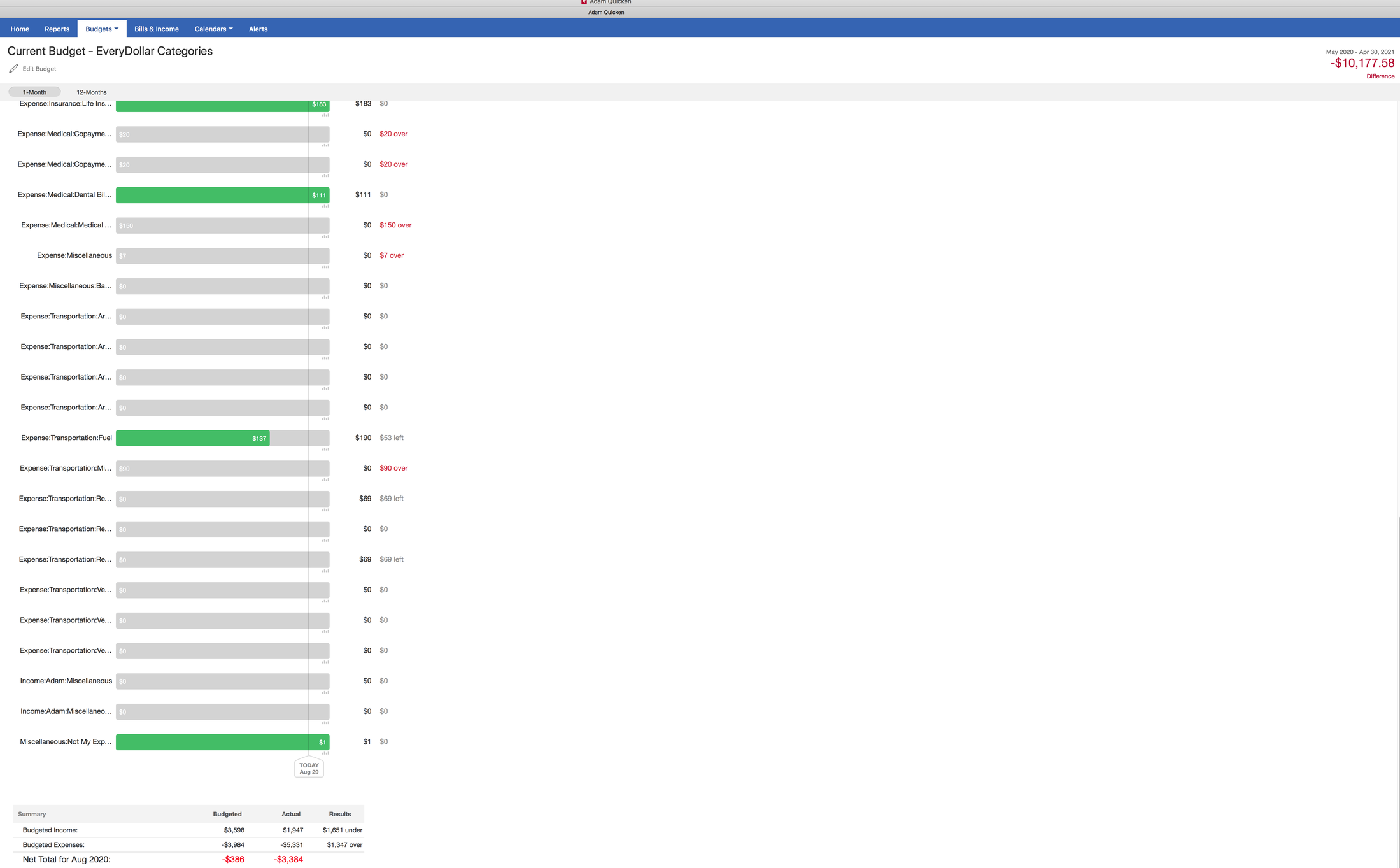

Tagged:
0
Answers
-
Hello @mybank2002,
Thank you for taking the time to visit the Community and post your issue, although I apologize that you have not yet received a response.
If you are still needing assistance, please take a moment to review the information available here and post back to let us know what version and release of Quicken you're using.
I personally don't seem to be experiencing excessive white space in the Budget area of Quicken for Mac:
If you have not already done so, I'd suggest checking the scaling of your PC display to determine if that helps to resolve the issue.
Please let us know how it goes!
-Quicken Natalie
0 -
Actually, @Quicken_Natalie your example, does have the issue that @mybank2002 is posting about, but in your case it's only one category: "Auto & Transport: Auto Insu…" in the screen you captured.
When I look at my one-month budget, the lack of space in the left column cuts off about a dozen of my category names -- and there is additional white space available on the right side of the screen that would make it desirable for the left column to be able to be wider. But the old one-month budget screen, which I believe was inherited from the old Quicken Essentials, has no user control over column widths, as transaction register screens do.
@mybank2002 I'm curious why you seem to have every category as a sub-category of "Expense" or "Income" or "Miscellaneous". That makes your category names unusually long (both here and in your registers). Why do you have a category called "expense" with all your expenses as a sub-category of that? Quicken is not designed to need that extra level of categorization, because every category has a Type setting for Income or Expense. I'd think you could solve much of the display problem you're experiencing if you move all your categories out from under those main categories you created. (Make a backup of your file before you move all your categories around, just in case you mess something up and want to revert.") ) Quicken Mac Subscription • Quicken user since 19931
) Quicken Mac Subscription • Quicken user since 19931 -
Thank you both for your reply and help, hopefully this is something Quicken can add to be able to expand the left column so I can see longer names or at least concatenate them to show the start and end so they are not just simply truncated.
@jacobs I have Income and Expense because I was finding the categories crazy on the Mac and unlike what I was use to of seeing all the income at the top in the Categories window they were all over the place and I wanted them sorted. The other reason was because often when I would enter in a transaction it would default to an expense category and it was just easier to see income or expense at the start. I had that same issue in Quicken for Windows as well.
Thanks again for your help.0 -
@mybank2002 I'm pretty sure the developers don't consider making every category a subcategory of two main categories called Income and Expense to be the way Quicken is intended to be used. If if works for you, that's fine; just understand that's not the way most people use it and it's not something they'd likely expend effort making easier to do.
That said, there is a Preference setting to allow for shorter category names:
If you switch to short names, Quicken will only use the ending level category. Some people prefer that, because it doesn't take up as much space. But in your case, it would undo the extra complexity you've added with Income and Expense main headings by hiding those main categories from view. But for the one-month budget screen you initially posted about above, the categories are automatically separated by income and expenses, so perhaps you would find the short names acceptable here.Quicken Mac Subscription • Quicken user since 19930 -
Thanks, that preference didn't change anything for me in the monthly budget view though I really do like having the long names I could get by changing that each time. Regardless I feel like you went down another path because you saw the way I categorize things as if that was the only issue with the fixed small column. Even if I took Income and Expense out it would still truncate my names because I like a lot of people have sub categories that are truncated.
I appreciate your help and would don't want the engineers thinking I am some special case exception based on your comments. Half of my screen is white with the names truncated. Just adapt to a persons screen or let them adjust the screen. It is so frustrating when Apple does that with their presences or things like Disk Utility where it is flexible and then some engineer gets a bug and decides to fix the size of a window or things on a screen. If you end up truncating anything without a way to at least over over it and see what is I would consider a design flaw not a special case situation.0 -
Well, just to be clear, going back to the beginning of this thread, I said I agreed with you that they could/should make that column wider on that screen.
")
The single-month budget screen is one of the holdovers from the predecessor Quicken Essentials program that served as the code base for the current Quicken Mac, before they developed the more comprehensive annual budget functionality. I don't think that one-month view screen has been touched all that time. I don't know what plans they have for this area of the program, but I'd expect them to either revamp/re-write the one-month budget screen or find a way to get rid of it if you could specify the time range you wanted to see for budgets (e.g. a year, a quarter, a month, etc.). It doesn't format well for printing and can't be exported, so it's in need of being updated to match capabilities in other areas of the program. It's just likely a lower priority than some of the other budget enhancements a large number of users have been pleading for for years.Quicken Mac Subscription • Quicken user since 19931 -
Thanks and my apologies for being defensive. I should have waited to reply to that one. I very much appreciate your help and love hearing the history, I wasn't aware of all that and that it was old code and what it has looked like for years.
I am glad they are a lot of requests for improving the budget features. I hope to see what they bring to Quicken in this area. It is a huge reason to track in Quicken in the first place. Thanks again for all your help and not getting defensive to me being defensive I appreciate that.0


This discussion has been closed.