After reading a few threads here about whether AI could actually be useful with Quicken data, I got curious how far you could realistically take it.
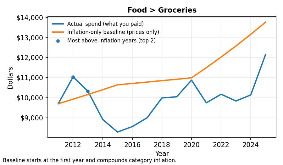
One thing I’ve always struggled with is understanding how my spending really changed over long periods — especially separating inflation from actual behavior.
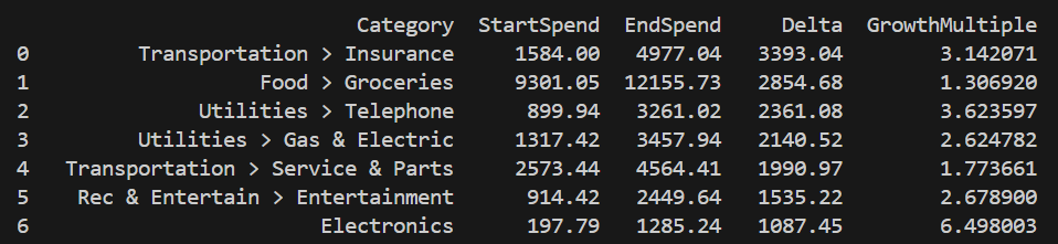
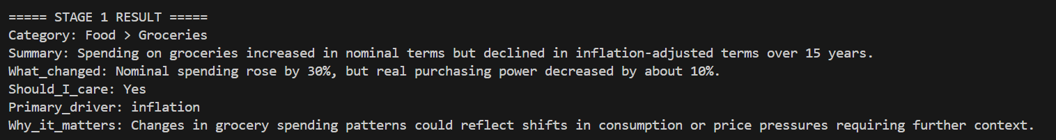
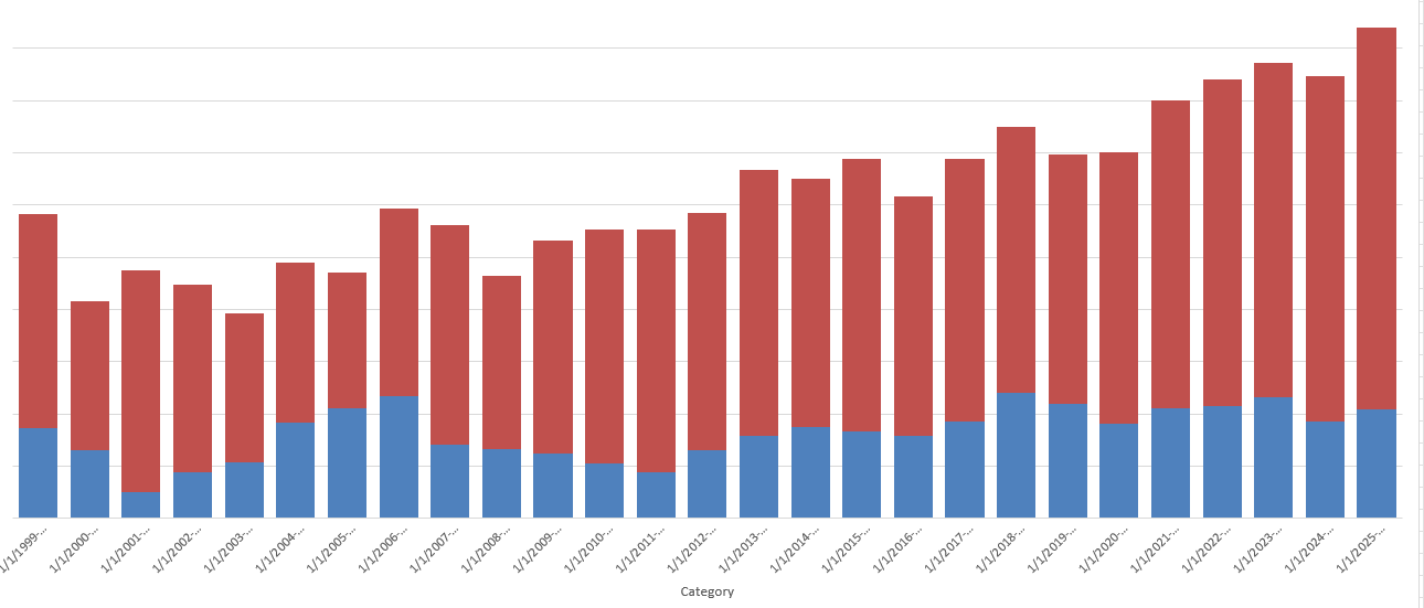
So, I tried a small experiment using about 15 years of my own Quicken history, comparing category spending against inflation just to see what actually stands out.
Here are two examples.
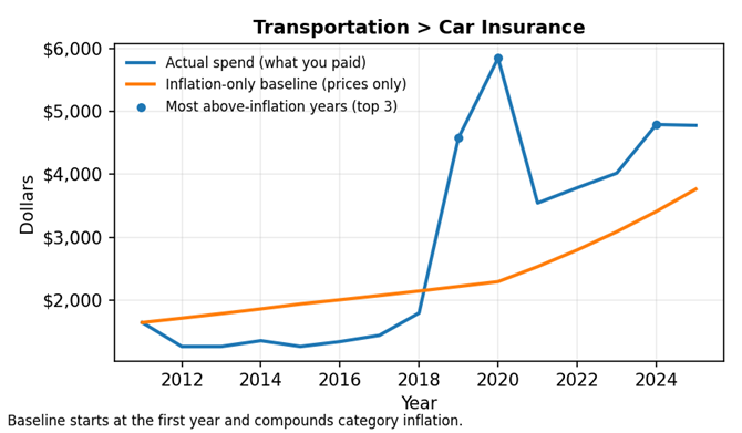
Car Insurance
Spending increased well beyond inflation over the 15-year period, remaining elevated rather than appearing as a short-term spike.
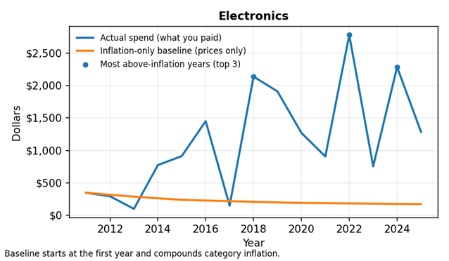
Electronics
Even as prices declined over time, total spending still increased, resulting in meaningful real growth beyond inflation.
What surprised me is that some categories still grow meaningfully beyond inflation, while others look dramatic on the surface but not in real terms.
Under the hood, the math is done first (inflation comparisons by category), and AI is only used afterward to summarize what stands out in plain language — nothing predictive or automated.
I’m honestly not sure how useful this would be for others, which is why I’m posting here.
A few questions I’d really value feedback on:
- Does this type of view feel useful or mostly obvious?
- Is the graph intuitive without much explanation?
- What category would you most want analyzed this way?
Appreciate any thoughts — just trying to learn whether this kind of insight actually resonates.
Privacy note: All examples shown are aggregated by category and year only