Curious experiment using long-term Quicken data — would love feedback

After reading a few threads here about whether AI could actually be useful with Quicken data, I got curious how far you could realistically take it.
One thing I’ve always struggled with is understanding how my spending really changed over long periods — especially separating inflation from actual behavior.
So, I tried a small experiment using about 15 years of my own Quicken history, comparing category spending against inflation just to see what actually stands out.
Here are two examples.
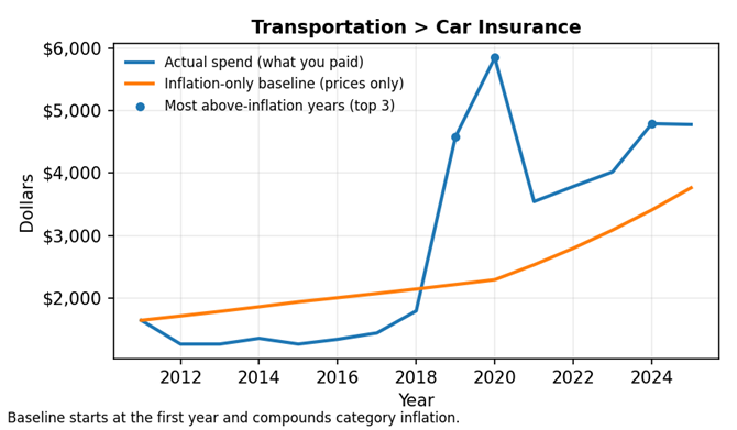
Car Insurance
Spending increased well beyond inflation over the 15-year period, remaining elevated rather than appearing as a short-term spike.
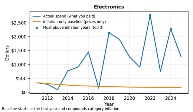
Electronics
Even as prices declined over time, total spending still increased, resulting in meaningful real growth beyond inflation.
What surprised me is that some categories still grow meaningfully beyond inflation, while others look dramatic on the surface but not in real terms.
Under the hood, the math is done first (inflation comparisons by category), and AI is only used afterward to summarize what stands out in plain language — nothing predictive or automated.
I’m honestly not sure how useful this would be for others, which is why I’m posting here.
A few questions I’d really value feedback on:
- Does this type of view feel useful or mostly obvious?
- Is the graph intuitive without much explanation?
- What category would you most want analyzed this way?
Appreciate any thoughts — just trying to learn whether this kind of insight actually resonates.
Privacy note: All examples shown are aggregated by category and year only
Comments
-
What is used to calculate the inflation?
One thing I realized long ago when I thought about calculating such things is that it is near impossible to get reasonable numbers for this for a given person. Numbers like CPI are useless.
0 -
@Chris_QPW , Hey Chris. Hope all is well. I mapped my Quicken categories to the subcategories under CPI. CPI serves as a baseline to compare my spend against. I also thought about using peer data. Compare spend against others in the same location, income, household size, etc. The blue line tells me enough regarding my spend. I was looking for something to help refine the data so I know where to focus my energy, therefore CPI. I did like the way AI reasoning was able to add commentary to further define my spend over time and tell me which categories I need to focus on
0 -
Every year around this time for the last 10 years, I run a saved report in Quicken that compares YoY spend for the last 2 years (ex. 2024 vs. 2025) by category. The report shows the spend diff. for each category but not much else is gained from the report. It's a very flat and not very useful report. I do calculate the high spend categories and I look for huge anomalies but that's about as far as I go. I have 99% of my spend recorded in Quicken, which includes cash (extremely small) and even Amazon spend. I wanted to see if using AI could provide actual insights from the data. I have a gold mine of data. It's really the next evolution versus static reports and dashboards. So far, I like what I see from AI but I'm just getting started.
0 -
This data would certainly inspire me to dig deeper to find why my car insurance was so high in 2019 and 2020. Did I have an accident? Buy a fancy new car? Have a newly licensed teenager in the family?
Also the inflation trend for electronics does not look very useful. The prices for equivalent TVs, computers or phones would have declined over the years, but I would guess that the cost of entry level devices have remained about the same even though the capabilities have increased. Probably inflation trends are more useful for stable commodities like groceries, fuels, etc.
QWin Premier subscription0 -
@Jim_Harman, thanks for the feedback. You are looking at the data the same way I am. I found it helpful to analyze the data the same way for high spend items. Somewhere, where I can possibly move the needle.
Regarding electronics, the interesting point was, cost of electronics is going down (orange line) but my spend is going up dramatically. I really need to look into those spikes. Something is not right. Thanks again
0 -
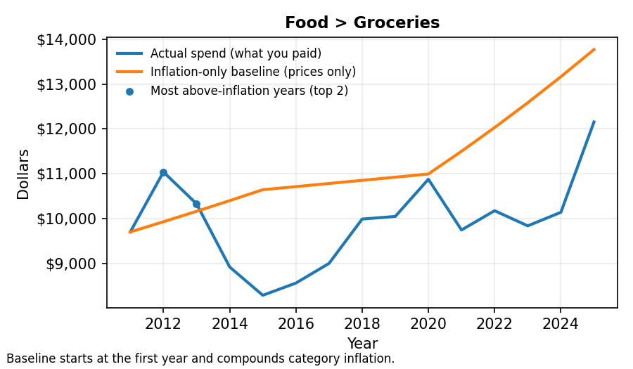
Check out this graph for Groceries. Opposite of electronics where inflation costs were going down. My overall spend for groceries was flat 2018 - 2024 but then it really went up in 2025, I assume due to inflation.
 0
0 -
Here are the reasons I have never found "inflation" numbers useful.
- Even if I was to associate categories to CPI sub numbers, those aren't for where I live, they are this mystical place called "average household".
- I don't trust the CPI numbers. I guess they are better than nothing, but not by much. They certainly don't seem to line up with the increase in prices our grocery stores for instance.
- My categories are way to general. "Groceries" for instance, there is no way that all the groceries are at the same inflation rate.
- I don't track by "unit", and you can't really even do that in Quicken. For this to work without units you have to assume that you are buying the same unit amounts year in and year out. I actually might be in a better position these days for that since the last time I looked at this because we are pretty much retired, but in the past, it just jumped around too much.
Looking at your graphs, I see the same problem. I don't think you got some great bargains in 2015 that offset the increase in inflation in groceries. Your change in spending way overwhelmed the supposed inflation part.
0 -
@Chris_QPW , all good points. Thanks for sharing. The inflation line is there so I have something to compare my actual spend against; it can easily be excluded if it's not helpful.
Not sure why the Grocery number is low in 2015. It's probably a data issue. The huge spike in 2025 for Groceries is real. I ran my EOY comparison report from Quicken and groceries increased +22% in 2025 compared to 2024. I know this is real, I feel it every time I go to the store, therefore in that example showing the inflation orange line helped to confirm the spike. Let's hope we don't see double-digit grocery increases in 2026. btw, I live on the peninsula near Silicon Valley where everything is already expense. Not sure if others experienced the same +22% increase last year for groceries.I checked the spikes shown in the Electronics graph by reviewing the data in Quicken and it turns out our family of four was purchasing new iPhones and laptops every 2-3 years. This one is easy to fix. I'm shutting down the electronic upgrades. I'll give the family an option either upgrade your devices or have food on the table, but not both.
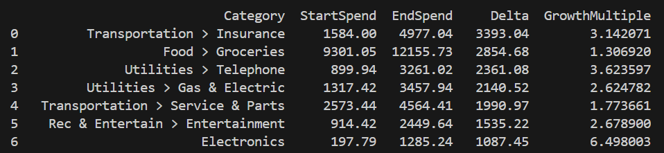
Lastly, I'll be going through this same exercise for the top categories that have the biggest delta between the start and end year. I want to make sure and focus on areas where I can make the biggest impact:
 0
0 -
San Jose here, so yeah, crazy prices.
I have definitely used Quicken reports in the same manner and I could certainly see where AI could help. I'm a bit doubtful though that Quicken Inc could pull it off with the old structure of Quicken and the resources they have, might just make things worse.
0 -
SJ… that's cool. I'm in Foster City. We should get together for coffee sometime. We can invite other Quicken users and have a small user group session.
I agree with your AI comments. Quicken shouldn't touch the existing structure but they could create an extension to the backend to support AI access to the data. The power of AI is in the reasoning capabilities and finding insights from existing data. Minimal if any changes would need to be made to the frontend but giving AI access to the mountain of data in the backend could be helpful.
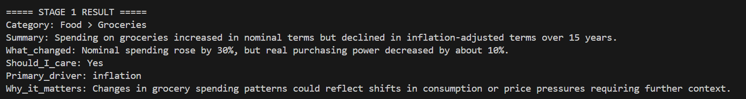
I'm still playing with AI to see if I can build a decent reasoning prompt to get value from my data. Following is sample output from my AI prompt (going through top 10 spend categories). Note, you can easily tell AI to ignore the inflation data if it's not important.In this example, AI (using reasoning) came up with the fields shown, excluding the Category field. There's still work to try and make the Should_I_care and Why_it_matters fields more informative and useful. End goal is get insights that can produce value if the correct action is taken. Still work to be done.
 0
0 -
I was thinking about this, and Groceries is probably the one category that the least "mixed up" as in most likely to be categorized right, so I decided to look at a yearly level. At first, I tried to do this in Quicken but realized that it doesn't allow for separate colors for different categories, and I decided I wanted to have both Groceries and Dining because at any given time we might pick one over the other for "food". So, I exported it to Excel and graphed it.
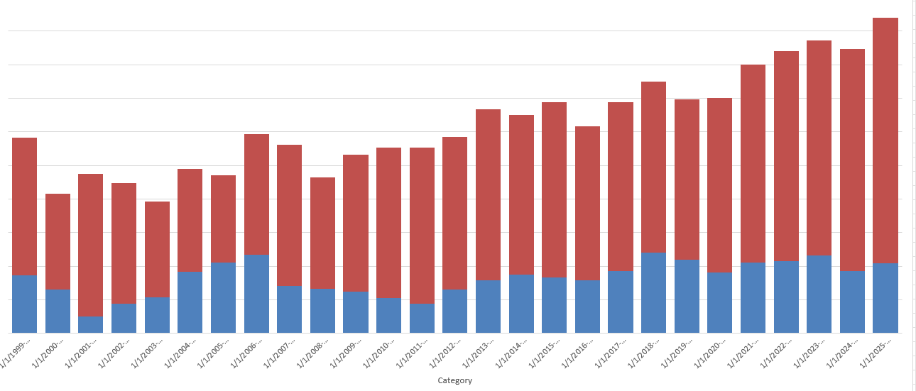
You can definitely see the upper climb of inflation but pinning it down for any given year even though my wife and I have pretty much been doing the same spending since about 2018. But if I look at say only grouped by 5 years, it would be very hard to tell normal variation from inflation.
0 -
@Chris_QPW, nice graph. This is exactly why pulling insights from spend data is hard without help. You had to export to Excel just to visualize and even then it’s tough to separate normal variation from inflation year to year. This is where AI should shine. Quicken already has the data, it should be doing the aggregation behind the scenes and combine it with inflation (optional), life stage, income, and location to explain what's actually changing and why.
I can easily imagine a future where we stop running static reports or export to Excel and instead just ask questions — and get clear, useful answers back.
0 -
I can certainly see that future too, but I doubt that Quicken will be the one to bring about.
0

