Feature requests for Quicken Classic for Mac - including showing proper cost basis

I've been using Quicken for Mac for a while now, and I have a number of suggestions for improvements:
1 - When I look at my investment accounts, if I have any cash in an account the cost basis vs market value is very misleading. My cash should have a cost basis of $1 per $1. Otherwise I have a cost basis way below the market value and it looks wrong.
2 - Why aren't there menu items and corresponding keyboard shortcuts to jump to specific views? Back when I was on quicken for windows, ctrl-U brought me to the investments view. With Quicken for Mac I have to click on the Investments item in the left nav and hope that I don't accidentally click on it twice (opening a secondary window). Having a keyboard shortcut would greatly improve this. Having keyboard shortcuts for key accounts would be helpful (command-1 for primary checking, command-2 for primary credit card, command-3 for investments, etc.)
3 - Quicken should have an "automatically add to Quicken" folder, similar to how iTunes allows you to drop mp3 files into a directory and have them auto-imported. If I download QFX or whatever files, I have to go into the Quicken app and use the File menu —> Import, like an animal. Please make it easier. It could check the folder once a minute, or only on startup… I don't care.
4 - I don't need so many pop-ups. Allow me to turn them off - "You are marking 3 transactions as cleared." I don't need to be prompted that repeatedly.
5 - Recurring bills needs a serious overhaul. I have 19 recurring bills (utilities, streaming services, etc.) and editing them is a major pain. The most used items in the "…" menu should be buttons instead of in a menu.
6 - Use a default business without prompting. I have a default business set. I have the business name hidden in my business credit card view because I have different cards for each business. Yet every time I enter a transaction it prompts me with "A default business will be used." Yes, obviously, that's why I set up a default business. I don't need to be reminded of that every single time.
7 - Calendar can only scroll through a month at a time? How about letting me go week by week, make the days taller so all transactions fit, etc. And why does it have both sides of a transaction on a given day - like for a credit card payment - I don't need to see both my checking account and the credit card's sides of the same transaction, pick one, or even better, show something like "Checking —> Chase" with the dollar amount.
8 - Have Payees and QuickFill Rules age out. I have like 3,891 Payees, if I haven't used them in a year they should go hidden. Same for QuickFill rules - I have 608, which is just too many.
These don't seem like huge lifts, please make Quicken more user friendly!
Thanks.
Comments
-
1 - When I look at my investment accounts, if I have any cash in an account the cost basis vs market value is very misleading. My cash should have a cost basis of $1 per $1. Otherwise I have a cost basis way below the market value and it looks wrong.
I agree. Since in many cases Quicken wants to track your core position as a cash balance, it seems wrong that the core MMF doesn't have a cost basis but any non-core MMF does.
The most used items in the "…" menu should be buttons instead of in a menu.
I don't agree here. Adding a bunch of buttons to each biller would just clutter up the screen, and different users are going to have different "most used items" on that menu depending on if they are manually billing, ebilling, or using a bill pay service.
Have Payees and QuickFill Rules age out.
As long as I could turn that off, sure. I want to be in control of what's hidden, not have things hidden automatically.
1 -
For these to be given ANY attention, these need to be created as separate posts in the Ideas section, but first check for any existing ones.
If you are now a Mac use, consider updating your profile in the forum to reflect that.
Have Questions? Help Guide for Quicken for Mac
FAQs: Quicken Mac • Quicken Windows • Quicken Mobile
Add your VOTE to Quicken for Mac Product Ideas
Object to Quicken's business model, using up 25% of your screen? Add your vote here:
Quicken should eliminate the LARGE Ad space when a subscription expires(Now Archived, even with over 350 votes!)
(Canadian user since '92, STILL using QM2007) 1
1 -
@BeLikeWater I have a few comments on your feature suggestions. First, a friendly comment for future reference: the best way to submit feature requests is to select the Product Ideas > Quicken for Mac section of this site and create a New Idea post there. Also, create a separate post for each Idea, so they can be voted on by other Quicken users and eventually considered by the developers; a list of unrelated issues is pretty difficult for other users to decide to support, and for the developers to know which specific parts have the most user interest. Actually, the best think it to look in Product Ideas to see i there is an existing request for what you're wanting, so you can add your vote and your comment rather than creating a separate, new Idea topic.
When I look at my investment accounts, if I have any cash in an account the cost basis vs market value is very misleading. My cash should have a cost basis of $1 per $1. Otherwise I have a cost basis way below the market value and it looks wrong.
I think the financial experts disagree with you on this. Cash in a brokerage account generally should not show a cost basis, as cost basis represents the purchase price of an investment (stocks, bonds, mutual funds) and is used to determine capital gains or losses upon sale. But Cash is a currency holding, not a security, so its cost basis is functionally equivalent to its face value, and it does not generate capital gains.
Why aren't there menu items and corresponding keyboard shortcuts to jump to specific views? Back when I was on quicken for windows, ctrl-U brought me to the investments view. With Quicken for Mac I have to click on the Investments item in the left nav and hope that I don't accidentally click on it twice (opening a secondary window). Having a keyboard shortcut would greatly improve this. Having keyboard shortcuts for key accounts would be helpful (command-1 for primary checking, command-2 for primary credit card, command-3 for investments, etc.)
I agree with you here. The legacy Quicken Mac 2007 also had a way to do this. There is an existing Idea topic asking the developers to create a sub-menu of Accounts which lists all visible accounts, so users could then assign a command key to any accounts that they want. Please click on this link and add your vote and post your comment:
Quicken should have an "automatically add to Quicken" folder, similar to how iTunes allows you to drop mp3 files into a directory and have them auto-imported. If I download QFX or whatever files, I have to go into the Quicken app and use the File menu —> Import, like an animal.
You should be able to simply double-click on a downloaded QFX file and have it open Quicken and import with no further action on your part. Have you tried this? If double-clicking a QFX file isn't doing anything, do a single click on the QFX file, and press Command-I (that's an "eye", not an "el"), or do File > Get Info. Look at the Info window and see if it shows Quicken under "open with":
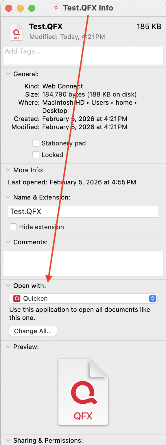
If not, select Quicken from the dropdown menu, and then just below that, click the Change All button to "Use this application to open all documents like this one". That is, any time the Finder encounters a QFX file to open going forward, it will open it in Quicken.
I don't need so many pop-ups. Allow me to turn them off - "You are marking 3 transactions as cleared." I don't need to be prompted that repeatedly.
I understand your point, but I'll respectfully disagree. Warning dialog boxes like this have been added because it's easy to a user moving quickly to click (or not click) a box they intended, or select a transaction they didn't intend, and the dialog gives a visual confirmation of what you're doing. If you know you've got it right, you need only press the Enter or Return key as soon as you select to mark the transactions cleared, you don't even need to wait to see the dialog; it really doesn't slow things down too much. Conversely, adding options for users to suppress various warnings like this seems like a logistical nightmare; if turning off the dialog box in one place only affects that one place, then there would need to be lots of such options throughout the program (e.g. the warning "Are you sure you want to delete this transaction?"), or it turning off warning dialogs in one place were to apply globally, users wouldn't even be fully aware of all the places they're disabling warnings. But if you feel otherwise, go to Product Ideas and create a New Idea post for that functionality.
Recurring bills needs a serious overhaul. I have 19 recurring bills (utilities, streaming services, etc.) and editing them is a major pain. The most used items in the "…" menu should be buttons instead of in a menu.
I have lots of recurring bills, and I don't find editing them problematic at all. It may depend on the approach you take. Many of my recurring bills like utilities, I have no amount in the scheduled transaction; when a bills comes in, I click the transaction, click Mark Paid, enter the Amount, and in many cases add/edit a memo (to document how many kWh or gallons I used).


For recurring bills which are typically the same each month, like my cell phone bill, the Amount is included in the scheduled transaction, but it's easy to edit if there's a variation in any month.

When the price changes on an ongoing basis, I double-click the transaction, click Edit All Instances, and change the Amount.
Can you describe what actions you find you need to take with your recurring transactions which you find to be a major pain?
Use a default business without prompting. I have a default business set. I have the business name hidden in my business credit card view because I have different cards for each business. Yet every time I enter a transaction it prompts me with "A default business will be used." Yes, obviously, that's why I set up a default business. I don't need to be reminded of that every single time.
Hmmm, I'm not seeing this at all. Whether or not the Business column is visible in a register, when I enter a transaction and select a valid business category, I get no prompt about the default business when I enter ra transaction; it automatically assigns the default business. I tried this in a credit card account which is set to business with my default business selected as the default for the card, I tried it in a credit card account with a different business selected as the default for the card, and I tried it in a checking account which is set to Primary Use=Personal; in all cases, as long as I selected a business category I never received a prompt about the business and it applied the correct business.
Can you maybe walk through your entry of a transaction, and what you are entering to see if we can figure out why you're seeing this and I'm not?
Have Payees and QuickFill Rules age out. I have like 3,891 Payees, if I haven't used them in a year they should go hidden. Same for QuickFill rules - I have 608, which is just too many.
I personally wouldn't want this. I love when I reuse a Payee I haven't used in a number of years, and it recognizes the Payee name and applies the QuickFile rule if I have one. I love the consistency: last time I purchased from this vendor, did I categorize it as A or B, because I want to be consistent and do it the same now. I have over 5,000 Payees and 1,000 QuickFill Rules as well, but I don't find they get in my way; I type a few letters and the list to pick from is generally quite short. How does having 608 QuickFill rules get in your way?
On the other hand, I would like it they added a "Date Last Used" column to Payees and QuickFill rules, as that would make is easy for users to select all Payees older than some time period and Hide them (or delete them in the case of QuickFill rules), go through and selectively hid many but not all which haven't been used in a long time. I think this solution would make it easy for you to achieve what you want — once a year, take 30 seconds to hide your Payees not used for more than a year — without affecting anyone who wants to do this selectively or not at all.
These don't seem like huge lifts, please make Quicken more user friendly!
Most Quicken users think that the things they want improved in Quicken (a) should be pretty obvious need, (b) should be done really soon now, and (c) shouldn't take much time to implement. 😂 While there are undoubtedly some tweaks which would indeed be easy, many things are more complicated than we think because they have ramifications or ripples through other parts of the program which the developers need to address. And Quicken is actually a pretty complex program with all the different options it gives users in how to configure and use it.
The big issue is that we Quicken Mac users have a lot of requests for the development team — and we mostly don't agree on which things should be the top priorities! If you look through the Product Ideas subcategories for Quicken Mac, you'll see there are a few hundred feature requests. About 3 dozen have more than 100 votes, and about 10 have more than 200 votes, but there are many, many ideas with smaller vote totals which have significant merit as well. Some of the Ideas, like most of yours, fall under "make Quicken easier/faster to use" to do something; some of the Ideas fall under "make Quicken do something which can't be done in any way now."
The developers have to sift through all these ideas and determine which ones they think would impact the most users, or might impact only a small number of users but have a major impact on them. They also have to assess how much work would be required to design, program and test each potential new or modified feature. And they have to decide which members of their team — did I mention that the Quicken Mac team is a tiny group? — will be needed to work on each project, and what their availability is. And then there are things they have to do which no one really sees just to keep the program up-to-date with Apple's changing tools and operating systems, with changes in bank security protocols, and with maintaining compatibility with other Quicken products.
In the end, they are able to crank out new releases roughly every other month, and each such release knocks a few wishlist items off the list (along with fixing reported bugs and infrastructure updates). The development team just isn't large enough to address all the things Quicken Mac users would like them to. When they spend a lot of time adding features for business users, the large majority of non-business users aren't happy with the progress. When they add Dashboards or Balances graphs, some users feel "I don't need that eye candy, I need a way to do corporate spinoffs/savings goals/budget reports/custom charts/[insert your favorite feature request here]… When you look back over time, you can see how much progress has been made, but that doesn't take away the frustration each of us may feel that our top wishlist items haven't yet been addressed.
Quicken Mac Subscription • Quicken user since 19930