"Spending by Category" tile in Dashboard: Incorrect details showing when categories are customized

Using Mac Quicken on my airpad. Within the Dashboard, I would like to exclude the category "Tax" from the spending by category tile - I only want to look at discretionary spending. However, when I customize the categories and exclude "Tax" (or any other category), only one transaction is listed when I click on the details of each category from the larger pie chart. For example, when I click on the "Travel" category from the larger pie chart, only one transaction is listed (a $3.50 Hudson News transaction) despite there being about $3,000 in transactions within the travel category. What makes it even more strange is that when I click on the little list icon in the top right (found to the left of the customize circle), all transactions are listed properly. This issue goes away when I remove any customizing from the tile (ie; restore defaults). It is a bizarre and frustrating bug.
Comments
-
"Airpad"? You mean a MacBook Air?
Anyway, I can see similar behavior but for me I see no transactions at all and it happens anytime the panel is not set to "All categories".
Here's an example of me clicking on the Utilities category. Here's what I see with the "All Categories" radio button selected:
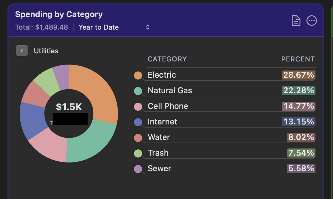
And here's what I see if I switch to the "Selected Categories" radio button, with all categories checked:
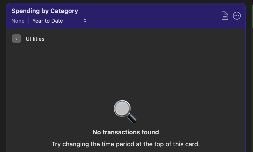
But then if I click on the document icon to get a list of the transactions, they all appear in the report.
0 -
Using Mac Quicken on my airpad.
@bnewsome72 Could you clarify what device you're using? I don't know what you mean by "airpad". Did you mean MacBook Air? Or iPad Air? I'm guessing the former, but just wanted to make sure so we don't answer in a wrong direction.
Quicken Mac Subscription • Quicken user since 19930 -
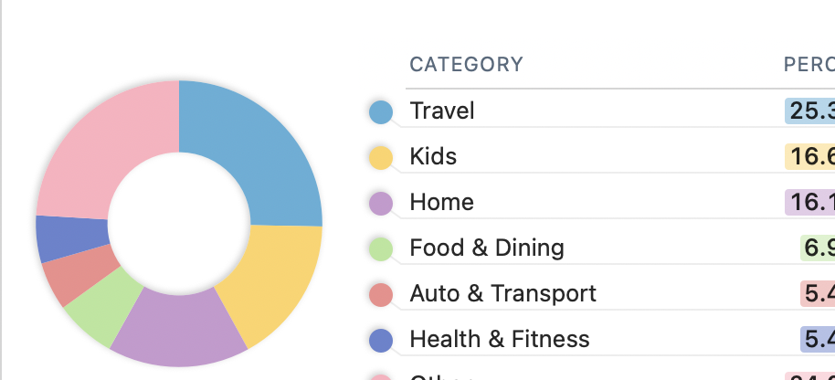
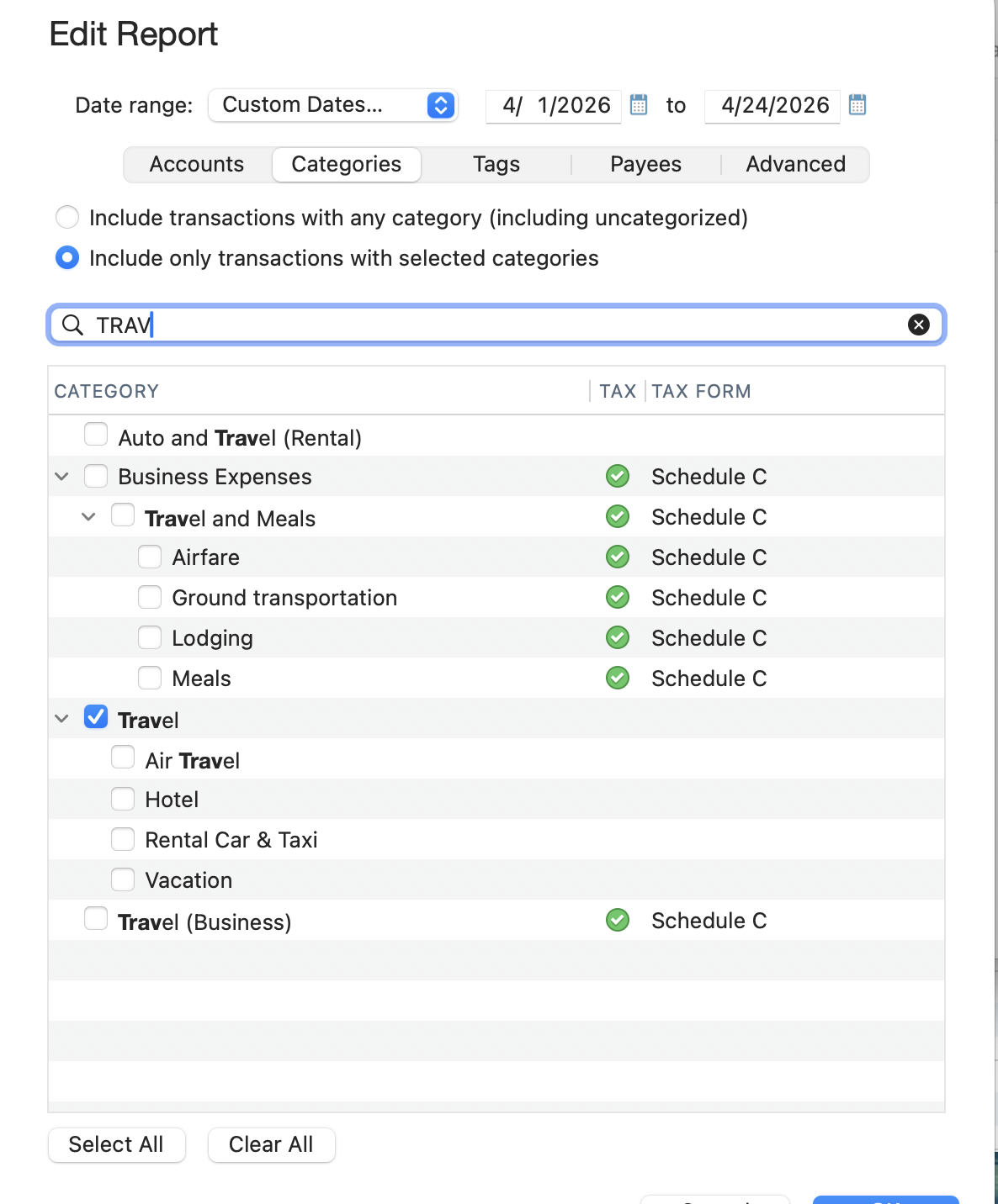
Sorry. That was an error. Macbook Air. Anyway, the exact same thing seems to be happening to Jon as me. I figured out what is happening but not why or how to fix it. When I click through to the details of a category in the pie chart, the details only show the topline category and exclude all the subcategories. For example, for "Travel", the pie chart of the details just shows the overall category "Travel" without the subcategories of "Air Travel", "Hotel", etc. (see screenshot below). However, when I click on the detail list (by selecting the list icon in the top right corner of the tile), all subcategories are selected by default (see last screenshot below). To summarize - pie chart details = no subcategories, list details - all subcategories. I doubt there is a setting that is doing this (that I can fix) and suspect it is a bug. Any thoughts?
The full piechart I see before diving into the details:
This is what I see when I select "Travel" from the larger pie chart to get details. It lists one transaction for $3.52 while the total is actually a few thousand dollars:
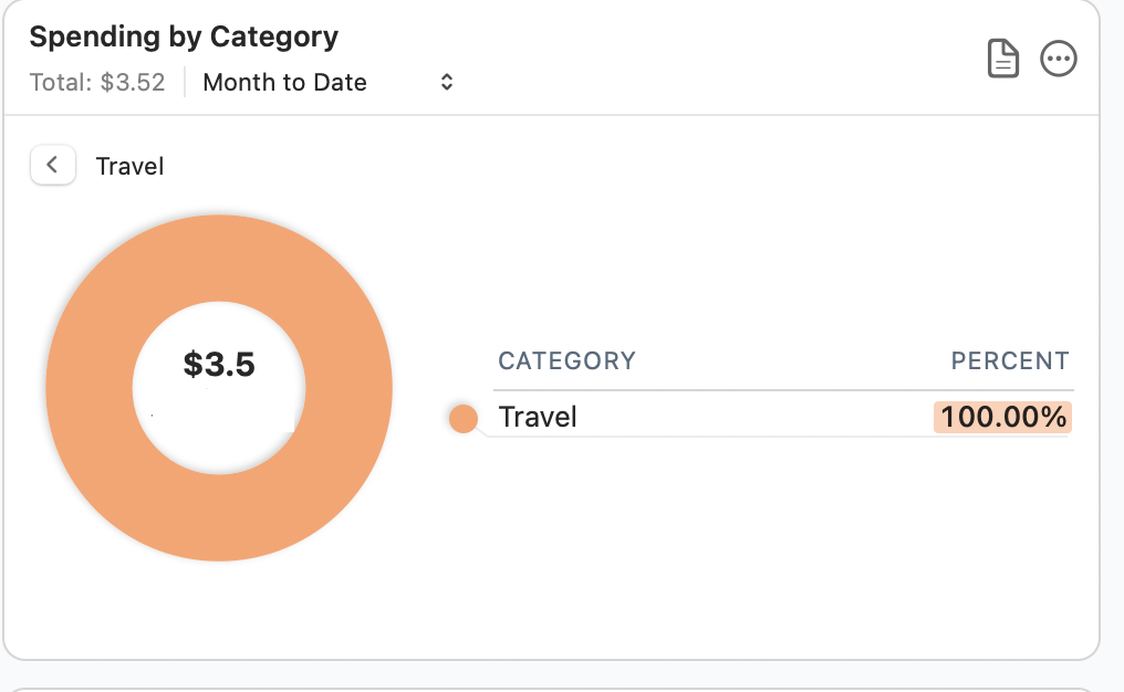
When I select the bubble in the top right corner to customize the categories, I find that only the topline "Travel" category is selected, but sub-categories are not. It turns out that the $3.52 transaction pictured above is the only one of my transactions that is categorized as the topline "Travel" category. All of the other transactions are in the subcategories so are not included in this breakdown.:
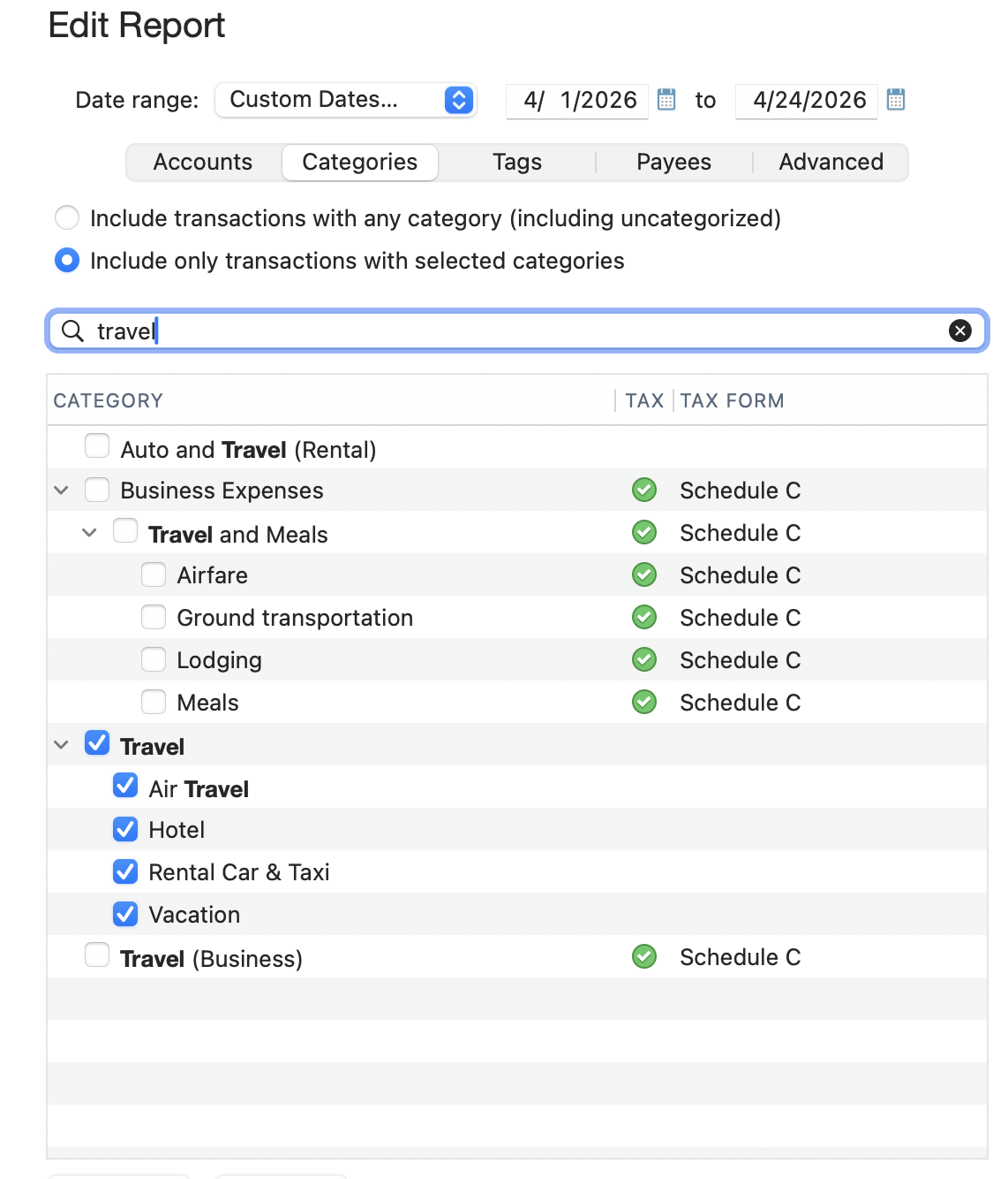
However, when I select the list icon in the top right category while within the "Travel" detail section, I find that all subcategories are selected:
 0
0 -
@bnewsome72 I think you've done a good job of describing the bug. I can verify that if I click on a category in the Spending by Category card which has no sub-categories, I get a report on that category as expected, but if I click on a category which has no sub-categories, I unexpectedly get a "No transactions found" message. As you've explained, that's because the drill-down is looking for transactions in the main category and not any of the sub-categories, and thus finding no transactions. Since the pie graph is including the value of transaction from all the sub-categories, the drill-down should match that. And this bug only surfaces when a user has configured the card to show Selected Categories instead of showing All Categories.
This bug was apparently introduced when the ability to drill down in this card was added in the 8.4 release back in December. (I don't recall anyone else reporting this before; I]m surprised it didn't come up in the past four months!) I've asked one of the Quicken moderators to send the report of this problem to the developers, so hopefully someone will take a look at it and be able to implement a fix in an upcoming release.
Quicken Mac Subscription • Quicken user since 19930 -
Thanks, @jacobs . Really appreciate it! It's driving me nuts. They've created a really nice tile, but it is not super functional with this bug. As an aside - is there a way to make the tiles larger?
0 -
One other note on this issue - it appears that the bug occurs when I customize the categories to be shown. As I mentioned in the in initial post, in this case I was excluding "Tax" from the categories. When "all categories" (the default) is selected, all of the subcategories within "Travel" are shown in the "Travel" pie chart.
0 -
@bnewsome72 Yes, the bug appears only when a user has customized the card to show selected categories instead of showing all categories; it works correctly if all categories (the default setting) is selected.
As an aside - is there a way to make the tiles larger?
A little. 😉 If you widen your Quicken window, the cards will expand horizontally, allowing for more text and, in the case of the Spending by Category card, an additional column showing dollar value in addition to percent of the total. But that won't change the size of the pie chart.
A little-known trick is that if you hide many/most most of the cards, the will resize vertically. If you hide cards so they fit in two rows (usually 4 or 6 cards visible, depending on the width of your Quicken window), the cards will resize to use the full height of the window and be taller than their default configuration. (If you hide more cards so they fit in just one row across — e.g. 2 or 3 cards visible, depending on the width of your Quicken window — the cards will jump in height to fill the entire height of the window!
To maintain the grid format of the dashboard cards, they are all a uniform size. When the dashboard was first introduced, I suggested that they at offer users a way to configure an individual card to be double-wide or double-tall; that wouldn't break the grid layout, but would allow a particular card to be bigger to suit a user's needs. That suggestion got caught in an Idea thread with multiple other suggestions about modifying dash card cards, most of which have quite helpfully been implemented (re-arranging cards, hiding/deleting cards, creating duplicate cards, customizing cards for accounts and/or categories). So since you've reminded me, I just created new Idea thread for the ability to resize Dashboard cards; click on it to add your vote and additional comments:
Quicken Mac Subscription • Quicken user since 19930
