Reports-Spending by Category Incorrect

Reports in spending by category are incorrect. The report shows the amount as the amount of the transaction not the amount of the split charged to that category.
Example:
Credit card transaction to XYZ company for $1000. The category for the charge is split between category A and B, $500 each. The Spending report by category shows $1000 in category A and nothing for category B. What am I doing wrong?
Classic Version R23.61Windows 10
Comments
-
When I open Reports-Spending by Category, I have a graph with a list on the right. Below that I see a list of the categories with total amounts. The amounts shown on the top right of the graph match the amounts shown in the list. But when a I click on the category to the right of the graph I get a different list and total then when I double click on the same category in the list. What is the difference?
Classic R63.21 Windows 10
0 -
When do you see this problem? In the main report that opens first, or when you double-click on one of the Category amounts?
[Edit] Sorry, I missed your second comment.
I see multiple issues with this report.
It appears that the list to the right of the graph only includes outflows, but the total shows the net amount.
QWin Premier subscription0 -
Sometimes a picture is worth a thousand words …
Can you please capture one or more images of the parts of your Quicken window showing the issue, sensitive information blacked out as necessary to protect your privacy but annotated to describe the situation, and attach the image(s) here?
How do I post a screenshot in the community from a macHow do I post a screenshot in the community from windows
Please save images to files of file type PNG or JPG only. They're easier to work with than PDF files.
0 -
Here is a screenshot of the upper right corner of the screen when I open Reports-Spending-By Category:
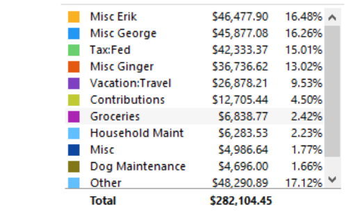
Now when I click on the $46,477.90 I get a list of transactions with a different total as shown below.
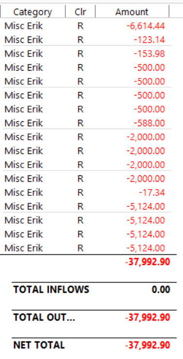
What is the difference? I believe I should see the details with the same total.
0 -
Theoretically, both reports should be using the same Date Range and Filter selections (accounts included, etc.) … do they?
0 -
@Tom G I agree this is definitely a bug. If you were to drill down on the transaction detail on the graph item and compare it to the drill down on the report for the same item, you will see the actual transactions that make up the difference.
What I am seeing is that the issue is the drill down for the the graph is not handling split transactions properly. Either the amount of the total transaction and not just the split is being reported, or the split transaction is not being included at all. There seems to be multiple issues with how split transactions are being reported (or not reported).
0 -
There's something else going on.
I ran the Spending by Category report, all accounts & all categories, for YTD. Then I clicked on the Groceries line in the report. I selected this because my state taxes grocery purchases thus EVERY purchase at a grocery is a split transaction (the Groceries line and the Sales Tax line).
The "Groceries" report that came up had the same total as did the main report.
SO, @Tom G have you checked to see if you've got some corruption in your Q data file?
Also, can you please post a graphic of the split transaction (showing the splits) that appears in your 2nd graphic? And if you turn on the display of Dates in that 2nd graphic, it might assist in identifying what's missing.
Q user since February, 1990. DOS Version 4
Now running Quicken Windows Subscription, Business & Personal
Retired "Certified Information Systems Auditor" & Bank Audit VP0 -
Yes, same date range and filters.
0 -
I see what is wrong. When a transaction is split, the split amount is not used in the category report. Sometimes the whole transaction amount is used and other times the transaction is not listed. I will call the help center.
0 -
That directly contradicts my experience, which I related above. Again, there's something else going on.
Please provide the requested graphic and make the requested change, so that we can further help you.
Q user since February, 1990. DOS Version 4
Now running Quicken Windows Subscription, Business & Personal
Retired "Certified Information Systems Auditor" & Bank Audit VP0 -
@Tom G I can confirm that I see the exact same issues with split transactions that you are. Please let us know what you find out when you contact Quicken Support.
0 -
I just discussed the issue with Quicken Support. She confirmed that the Spending by Category report is incorrect. It does not include split transactions. She recommend that I refer to the Itemized Categories report for the correct information. No plan to resolve the inconsistency.
0 -
@Tom G thanks for providing the update even though it's disappointing. From what I can see, there seems to be more issues with the graph than just that one. At least there are other ways to get to that same information which is correct and doesn't have issues.
0 -
@Tom G Is the problem you are seeing only when you drill down in the numbers next to the pie chart or click on one of the segments in the chart?
I ran the Spending by Category report selecting a just particular payee that often has split transactions.
In the report below the graph, I see all of the splits correctly and when I click on one of the numbers it shows just the portions of the transactions for each split, as expected.
But when I click on segments in the pie chart to see the details, the segment that corresponds to the first split line gets the full transaction amount and the others get zero.
Report and graph - this is correct:
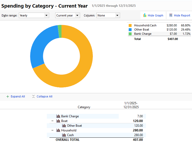
Clicking on the orange segment of the graph - this should be $280
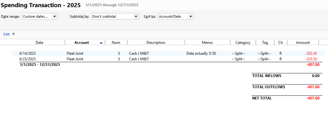
Clicking on the blue segment of the graph - This should be $120
 QWin Premier subscription1


