For those of you who are investors, the Portfolio X-Ray function (which uses an interface with Morningstar) plays a critical role in understanding the diversification and attributes of the whole and parts of your investment portfolio. It is probably the most important tool that facilitates Quicken providing the insight into your investment portfolio(s), unifying data to a single view from multiple sources of investment data. Quicken recently changed its process for populating the Portfolio X-Ray (through its interface with Morningstar) and in doing so reduced both the functionality of the tool and the accuracy of one of the graphs.
Specifically, the new "version" of the Portfolio X-Ray no longer allows the user to define which "benchmark" should be used against the actual data. Actually, the new version doesn't even bother to define the benchmarks used in the presentation. In addition, one of the graphs which depicts the overall view of diversification (the red dot) is wildly incorrect (see graphic below). Given the stock% weights compared to the Bmark%, the portfolio position indicator on the graph should be much closer to the middle of the triangle.
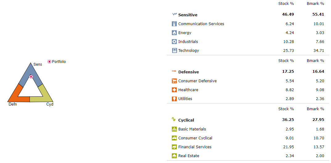
Finally, I have to hit the "Refresh X-Ray" button multiple times to get the data to populate, which should not be happening.
I am using the Windows 11 operating system and Quicken Classic Version R64.23.
Overall, my impression is that in this case, Quicken has reduced the functionality of the Portfolio X-Ray as opposed to improving it. I hope they did not make this change to save a few dollars at the cost of reducing the functionality of such an important tool.
I am a 30+ year user of Quicken and I am hoping that Quicken takes a look at the change it has made to this tool and reconsiders its decision.
Anyone else in my camp?